The IBM careers site is one of the most visited sections of Ibm.com and the primary source of IBM job applications. The current site is outdated, underperforming on mobile, in search, among other issues. In order for IBM to compete for top global talent, the career website needs to be redesigned.
Redesign the site’s user experience to ensure improved performance of the IBM careers website, and generate more qualified candidates for highly skilled roles.
To better understand the problem with the current website, I performed a heuristic evaluation, which involved browsing through all of the content, links, and flow of the website in search of UX bugs and improvement options. This audit was carried out by conducting research on IBM's competitors and supporting these hypotheses with data obtained from IBM's website.
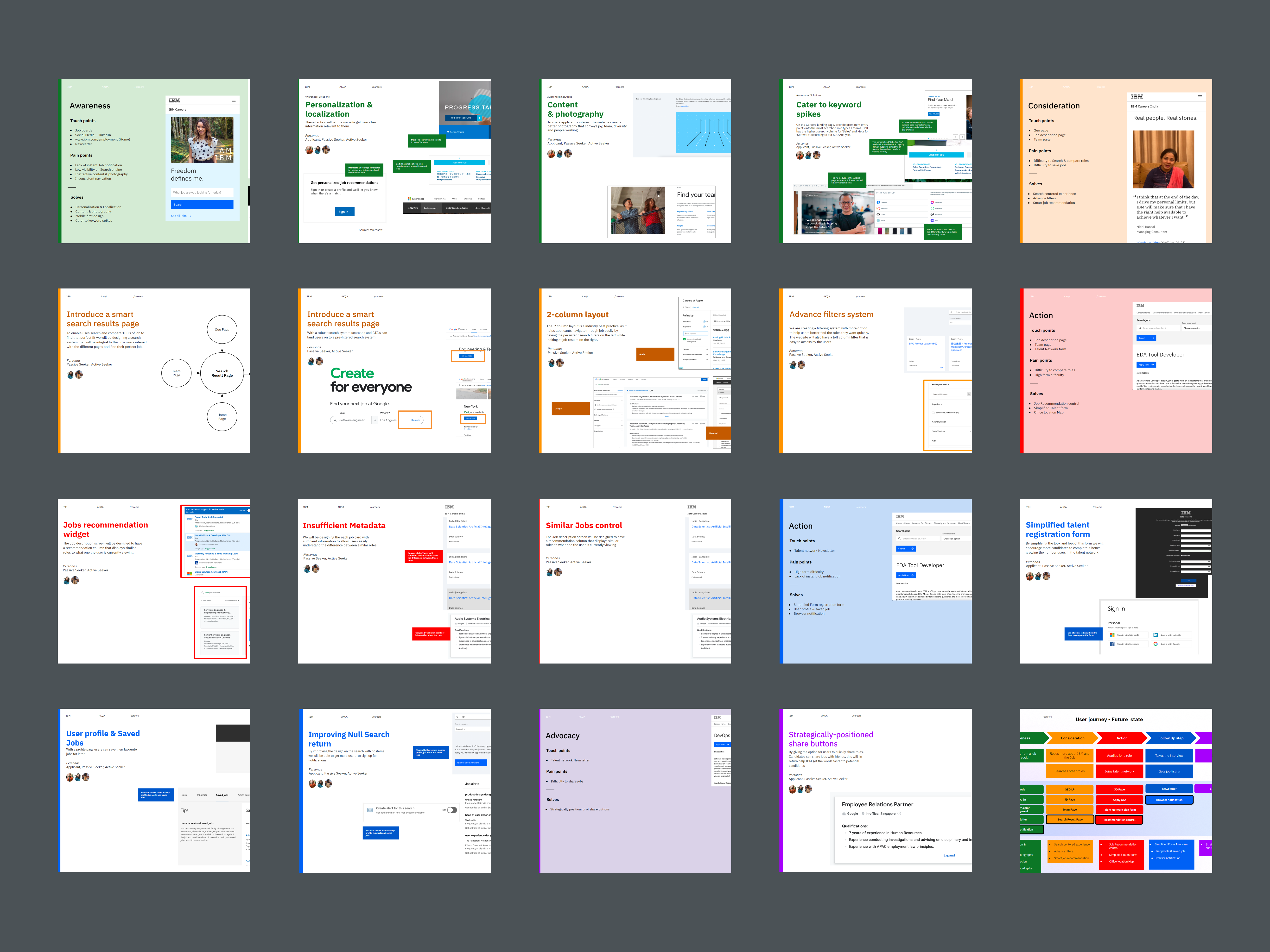
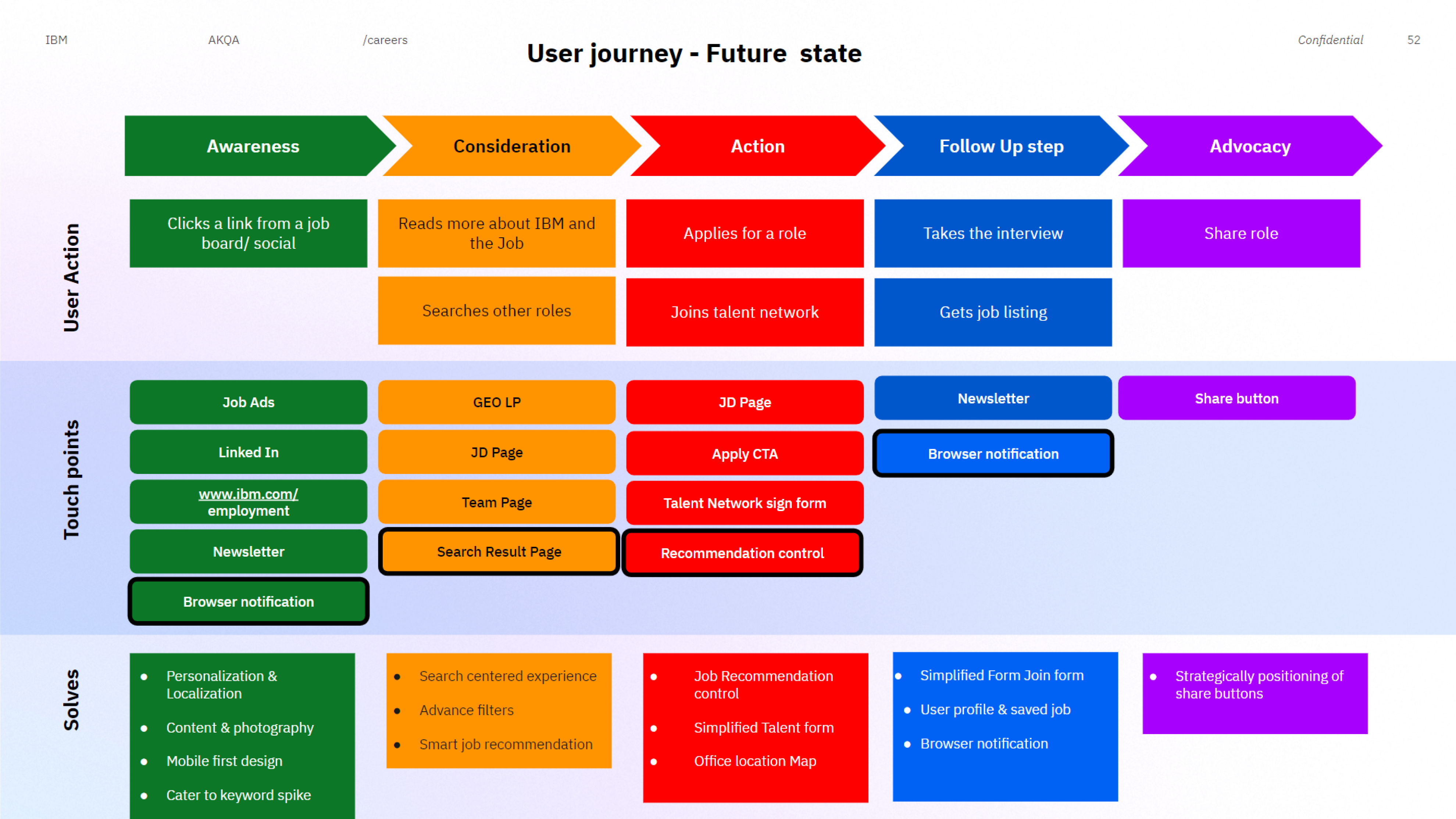
One of the serious issues with the website is the difficulty in finding a specific job listing. On the website, I discovered that there is no search result page. This isn't the best experience, and I believe this is the main challenge.
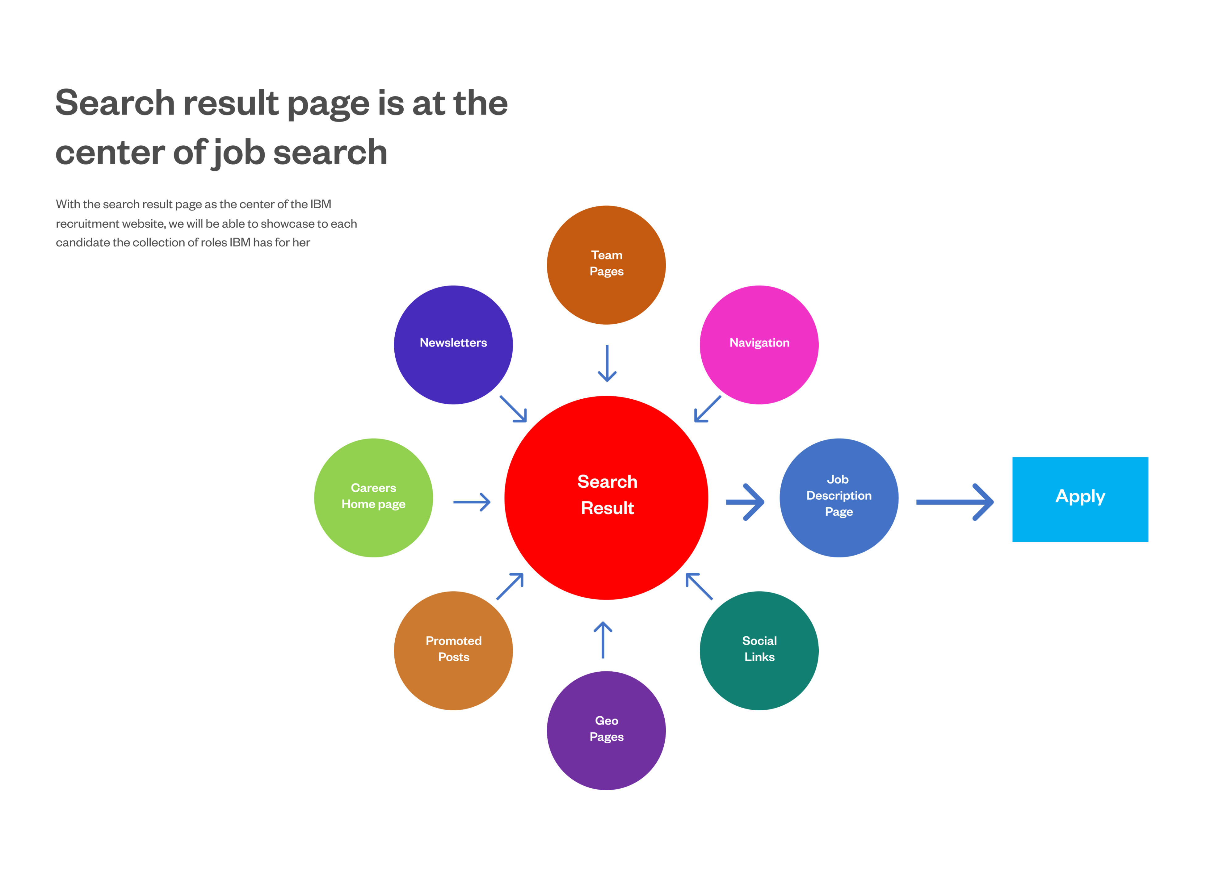
The solution is to make the search page the focal point of the career website, so that every journey leads users through it. This allows users to start a new search and use the filters as necessary. IBM will also be able to create a pre-filtered search that can be linked to from other pages and campaigns.
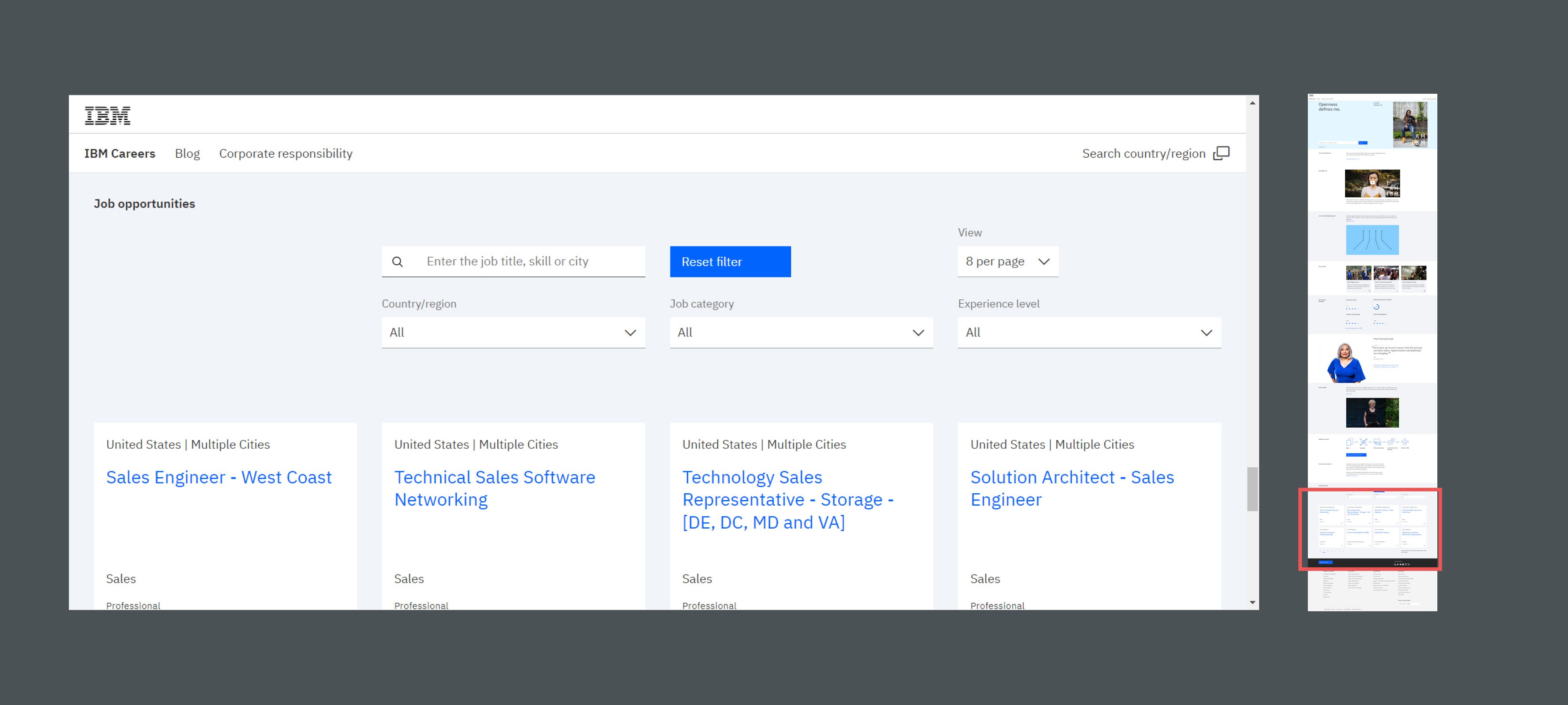
On the website, there is no dedicated search page. The search result is at the bottom of the home page. This gives it very low priority and limits the interaction it gets from the users.
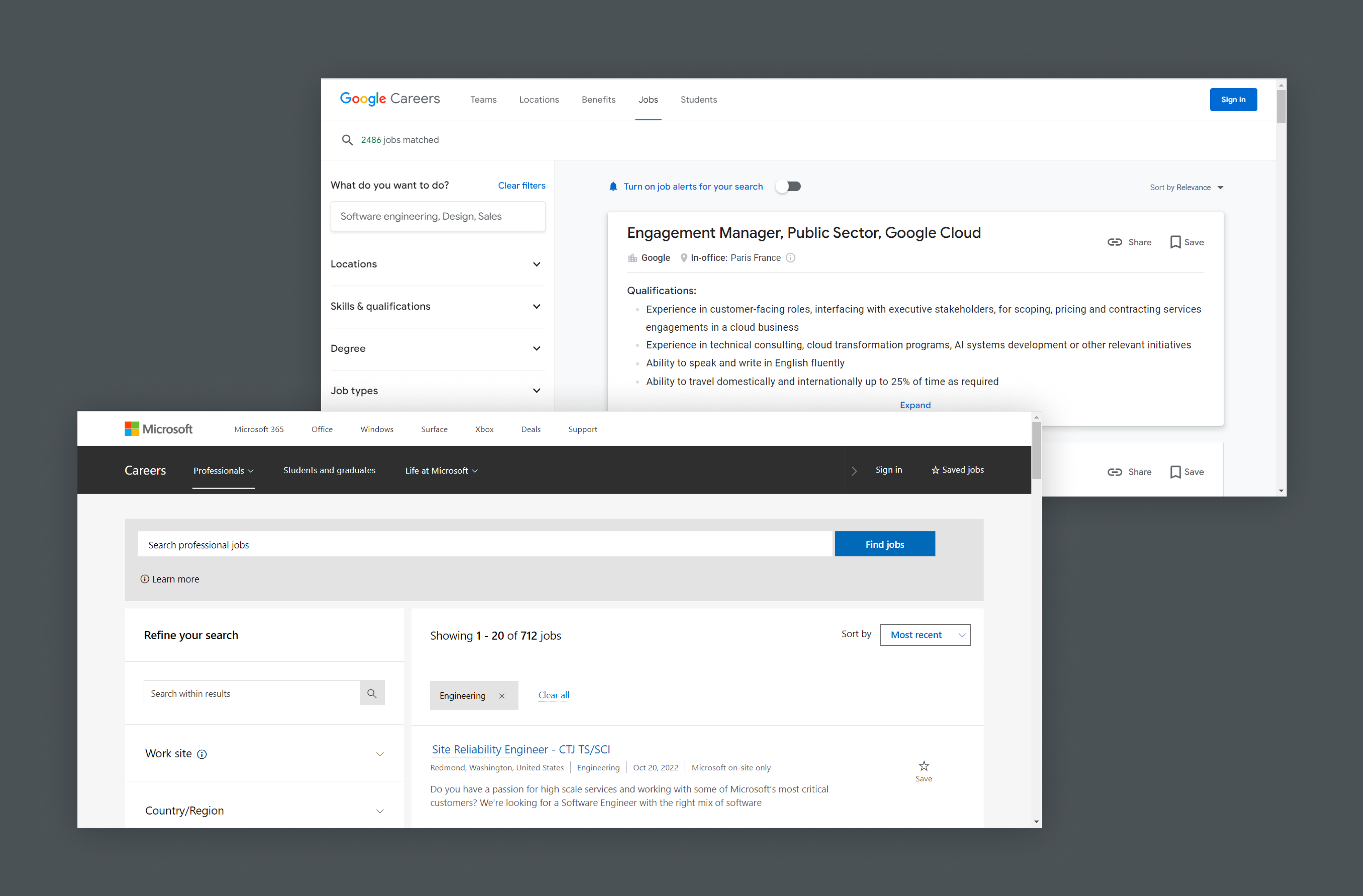
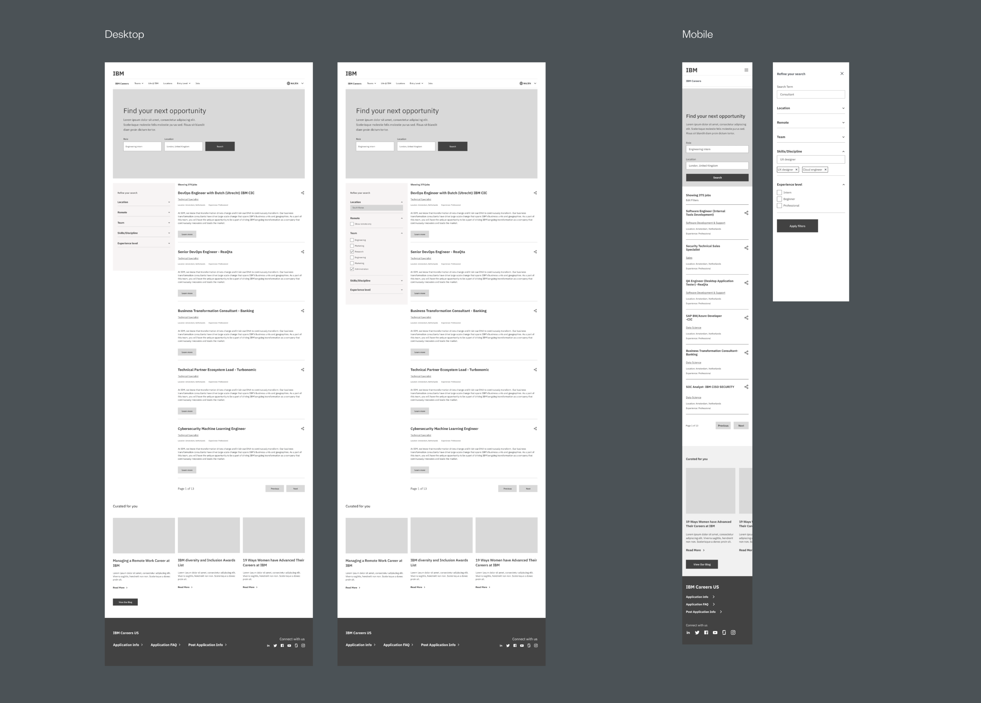
The solution was to create a search result page with a similar experience to Google & Microsoft. This page will display job search results as well as filter options to help users be more specific with their search.
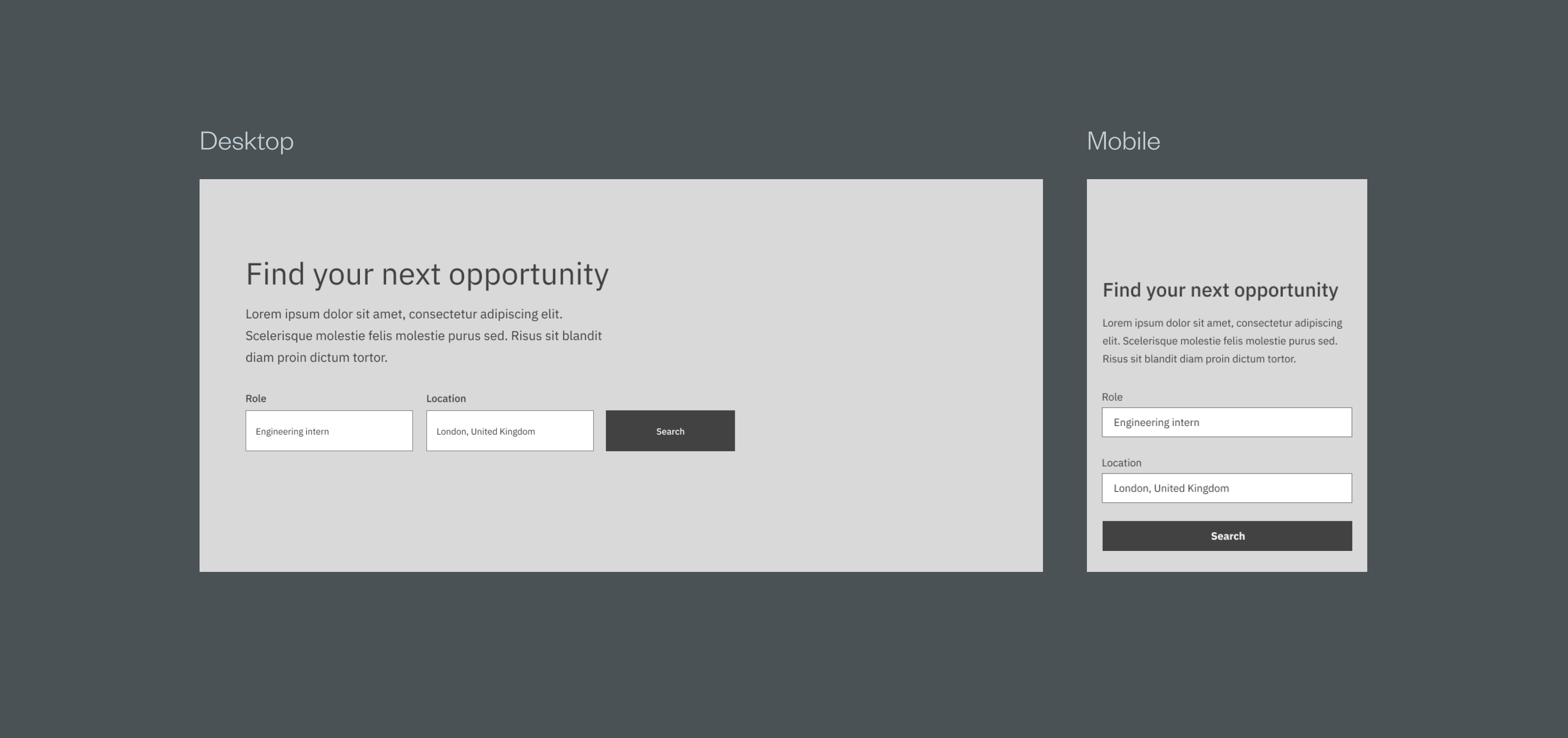
The hero was redesigned to introduce visitors (especially those who land here directly) to the IBM career website and also serve as an entry point for them to search for their desired role.
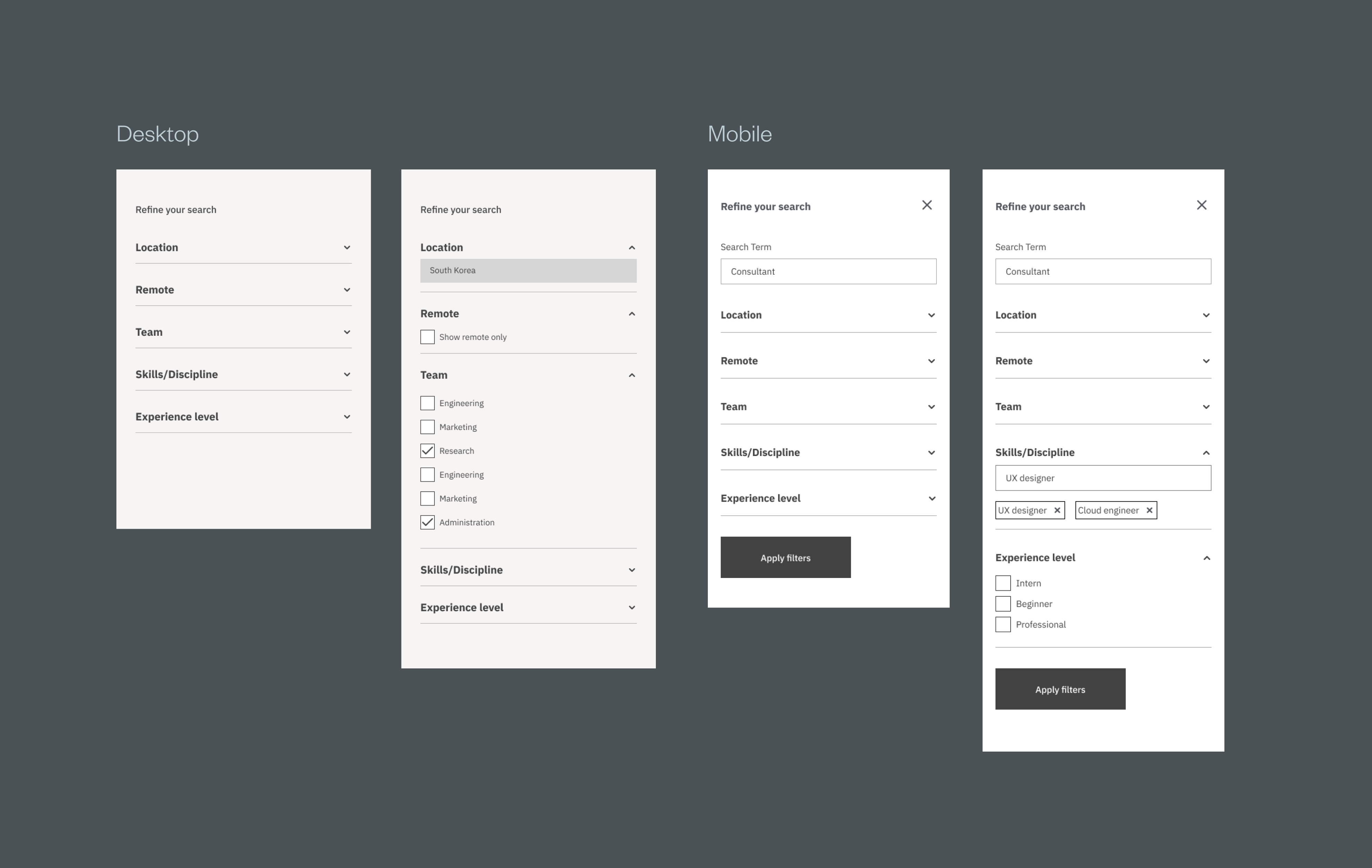
The filter section was design to help users who want to narrow their search for specific roles
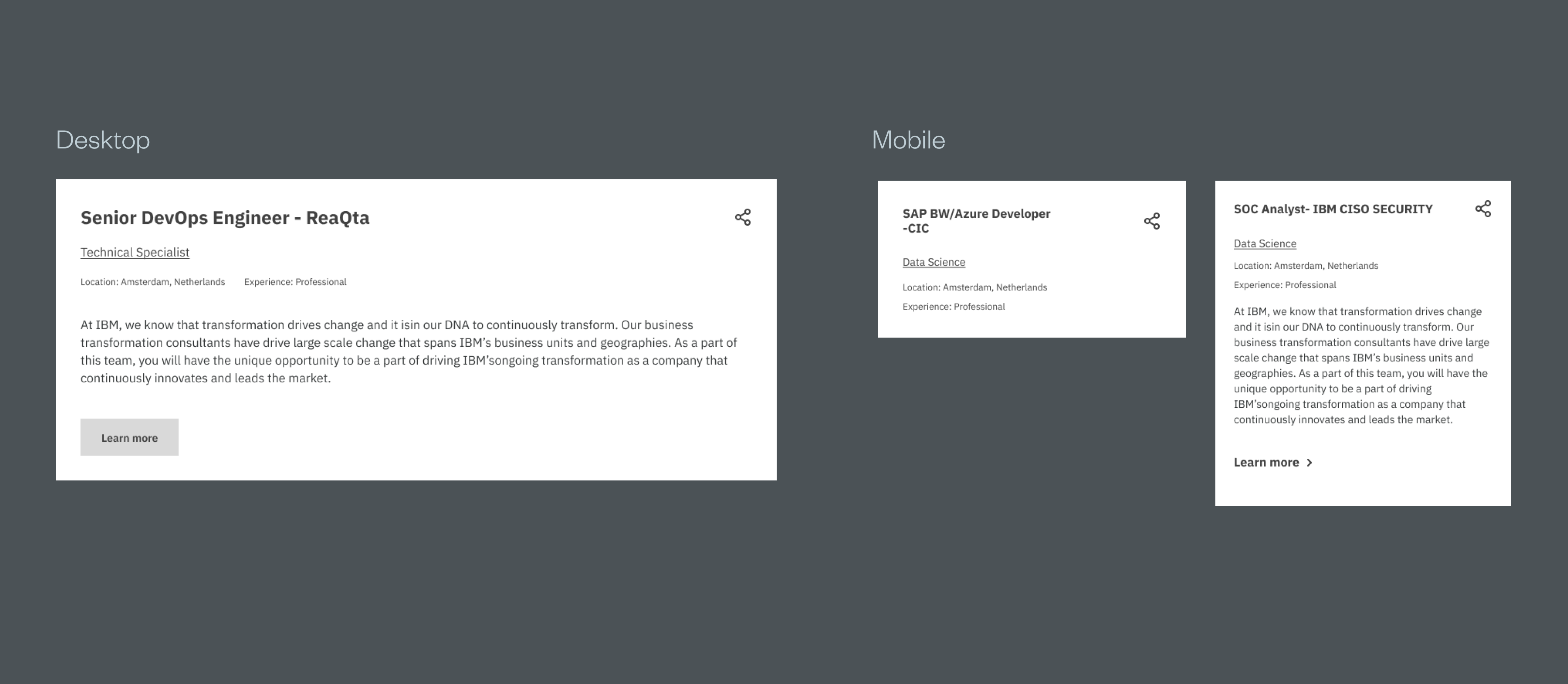
The user is able to see the main information about the job roles they are searching for. A button to learn more on both mobile and desktop to expand for a more detailed view.
The wireframes show the new redesigned career page for both desktop and mobile.
After presenting the wireframes to the client and stakeholders the idea was well received as the solution solves the issues affecting the career page website.
A high fidelity prototype will be designed and built using IBM’s carbon design system.